Why Learn Power BI? A Step-by-Step Guide for Excel Users
If you already use Microsoft Excel to analyze data, build PivotTables, and prepare reports, understanding why you should learn Power BI is the high-leverage next step to scale your analytical capabilities.
Strategically, adopting Power BI addresses three major operational bottlenecks inherent in spreadsheet-only workflows:
- Eliminating Manual Data Refresh Fatigue: Unlike static Excel reports that require manual data pulls, Power BI automates data ingestion and scheduled refresh workflows, turning recurring reporting into a hands-free process.
- Overcoming Spreadsheet Scale Limits: Excel begins to lag and fragment when handling millions of rows or connecting multiple disparate data sources. Power BI’s underlying engine (VertiPaq) handles massive datasets efficiently without performance degradation.
- Shifting from Static Artifacts to Interactive Explorations: Instead of emailing static PDFs or heavy workbooks, Power BI enables you to deploy web-ready, interactive dashboards where stakeholders can self-serve insights through dynamic filtering.
Excel remains unmatched for ad hoc calculations and deep exploratory modeling, making Power BI a complementary capability rather than a replacement.
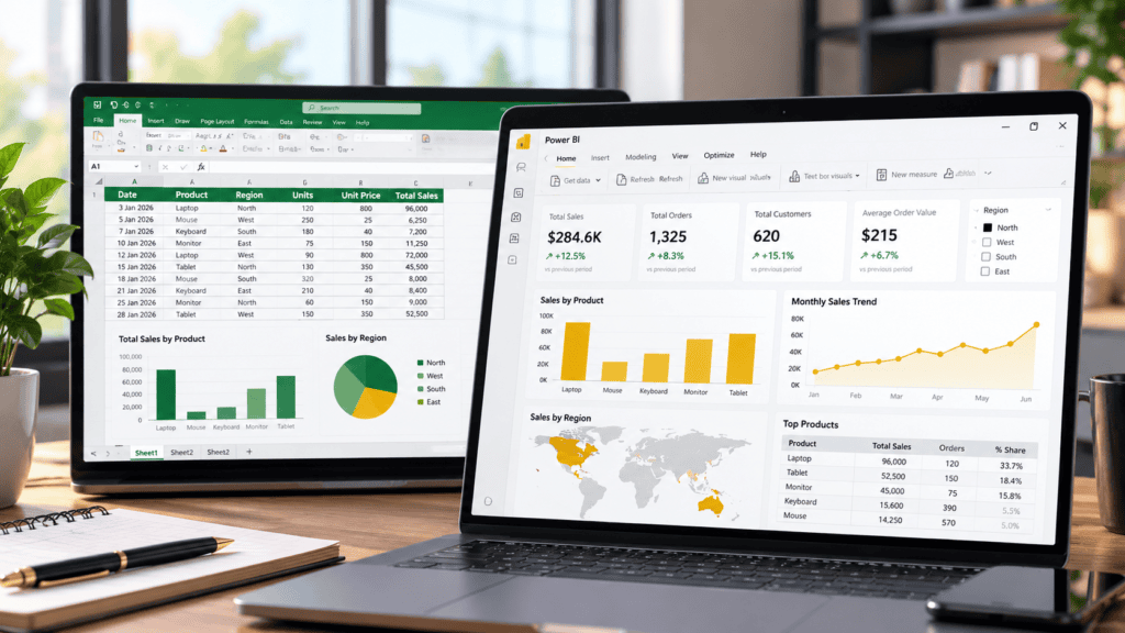
In this guide, you will learn the strategic advantages of Power BI, how it directly compares to Excel, which data modeling skills transfer seamlessly, and a step-by-step framework for converting a static Excel report into an interactive dashboard.
What Is Power BI?
Power BI is Microsoft’s business intelligence platform engineered for connecting disparate data sources, transforming data for analysis, building interactive reports, and sharing scalable insights across organizations.
The platform operates across two core environments:
- Power BI Desktop: A free Windows application used to ingest data, clean and transform tables, establish data relationships (models), and design rich report layouts.
- Power BI Service: A cloud-based online workspace utilized for publishing, managing, securing, and collaborating on shared reports (governed by organizational account and licensing tiers).
Practical Context: Excel vs. Power BI
Consider a standard sales report tracking monthly revenue, product lines, regional metrics, and salesperson performance.
- The Excel Workflow: You use formulas, PivotTables, and static charts to build a comprehensive workbook. While powerful, updating or filtering requires manual manipulation, and distributing changes often means emailing large files back and forth.
- The Power BI Workflow: You load the same dataset into a data model. A regional manager can then open the report, click a specific territory or month, and dynamically cross-filter every visual in real time without altering the underlying structure.
Core Comparison Matrix
| Feature / Capability | Microsoft Excel | Microsoft Power BI |
| Primary Strength | Spreadsheet calculations, advanced formulas, PivotTables, and flexible ad hoc analysis. | Interactive reporting, reusable data models, multi-source blending, and scalable sharing. |
| Data Handling Scale | Optimized for smaller subsets and cell-level flexibility (performance drops at scale). | Built on the VertiPaq engine to compress and process millions of rows efficiently. |
| Collaboration & Distribution | File-based sharing (via email, SharePoint, or network drives). | Cloud-hosted, web-ready dashboards with role-based access control and live updates. |
Importantly, these tools are not mutually exclusive. They work in tandem: Power BI can ingest Excel workbooks directly as data sources, while Excel can connect back to live Power BI semantic models (XMLA endpoints / Analyze in Excel) for advanced spreadsheet-based modeling.
Excel vs Power BI: What Is the Difference?
While Excel vs Power BI is a common comparison, these two tools are designed to complement rather than replace one another. Understanding their distinct architectural and analytical strengths ensures you deploy the right tool for the job.
Core Capability Comparison
| Capability | Excel | Power BI |
| Calculations | Cell formulas and spreadsheet functions | Measures, calculated columns, and model calculations |
| Data Preparation | Excel tables, formulas, and Power Query | Power Query for repeatable data transformations |
| Data Relationships | Tables, lookups, and Power Pivot data models | Relationships between tables in a semantic model |
| Visualisation | Charts, PivotCharts, and conditional formatting | Interactive reports with filters, slicers, and drill-down |
| Recurring Reports | Workbook updates, configured queries, and automation | Configured data refresh and report reuse |
| Sharing | Workbook sharing and collaboration | Power BI service (governed by permissions and licensing) |
| Best Use | Detailed spreadsheet work and flexible, ad-hoc analysis | Interactive business intelligence reporting and exploration |
Note: These are general distinctions rather than strict limitations. Excel features advanced data modeling and automation capabilities, while Power BI can perform complex calculations and support robust analytical models.
Should You Replace Excel with Power BI?
No. Most professionals do not need to abandon Excel to benefit from Power BI.
- When to use Excel: Inspecting individual records, testing ad-hoc formulas, preparing one-off analyses, or editing small, unstructured datasets.
- When to use Power BI: Building reusable reporting models, combining disparate data sources at scale, and distributing interactive dashboards for team exploration.
Practical Workflow Example
A finance team might leverage Power BI to publish an automated monthly expense dashboard while continuing to use Excel for detailed reconciliations and complex variance modeling.
The strategic goal of any data stack is utility: deploy each tool precisely where it adds the highest leverage.
Why Learn Power BI? 7 Benefits for Excel Users
Spreadsheets inevitably break down as data volumes scale and reporting demands multiply. Power BI eliminates the friction of manual data stitching and fragile static files, replacing them with automated, interactive dashboards engineered specifically to streamline complex data workflows.
Turn Static Reports into Interactive Dashboards
Excel charts communicate information effectively, but reports addressing multifaceted business questions often require sprawling workbooks filled with fragmented worksheets, complex PivotTables, and manually managed filters.
Power BI consolidates related charts, tables, and key performance indicators into a unified, interactive canvas. Rather than consuming static outputs, stakeholders can filter by category, region, product, or timeframe to dynamically interrogate the underlying data.
An enterprise sales dashboard typically comprises:
- Core Metrics: Total revenue and period-over-period growth trajectories.
- Product Breakdown: Revenue distribution across categories and stock-keeping units.
- Temporal Analysis: Granular monthly or quarterly sales trends.
- Geographic Performance: Regional output mapped against targets.
- Contextual Slicers: Dynamic filters for individual sales representatives or reporting periods.
A sales leader can select a specific territory to instantly re-index every visual across the dashboard—eliminating the need to generate, format, and distribute bespoke workbooks for every regional stakeholder.
Why it matters
Building one rigorously designed, multi-dimensional report replaces the unsustainable overhead of maintaining dozens of redundant spreadsheets.
Combine Data from Multiple Excel Workbooks
Complex reporting workflows frequently require aggregating information scattered across disparate files—such as a finance team gathering departmental expense sheets or regional sales units maintaining independent branch records.
Relying on manual copy-and-paste routines to compile a master workbook introduces significant operational risk, including inconsistent column naming conventions, dropped records, and silent formula breakage.
Power BI solves this integration bottleneck via Power Query. Rather than handling files manually, you establish persistent data connections that automatically ingest, clean, and consolidate disparate sources into a unified data model.
Consider a multi-branch consolidation scenario:
- The Source Files: Three regional branches generate separate monthly sales spreadsheets sharing a common column schema.
- The Automated Pipeline: Power Query establishes a repeatable transformation routine that appends these files into a single, cohesive dataset.
- The Caveat: This automation relies on structural consistency. If underlying worksheets, column headers, or data types drift, your transformation logic will require a quick update.
Why it matters
Automating data consolidation eliminates fragile manual data prep, ensuring your reporting pipeline remains accurate, repeatable, and scalable as data volumes grow.
Automate Recurring Reporting Tasks
Producing periodic reporting cycles—whether weekly or monthly—often traps analysts in repetitive, low-value loops: importing files, cleaning anomalies, recalculating totals, and manually reformatting charts.
Power BI removes this overhead by decoupling asset creation from data updates. By building your data transformations and report visuals once, you establish a repeatable asset that updates automatically whenever the underlying data changes.
Understanding the limits of automation:
- Refresh $\neq$ Complete Autonomy: A scheduled refresh pulls new data, but it cannot fix upstream operational failures. Human intervention remains necessary to upload source files, correct malformed records, maintain API credentials, or repair broken source pathways.
- Infrastructure Dependencies: Successful automated refreshes rely on proper configuration—including data source accessibility, on-premises gateway requirements, service capacity limits, and appropriate user licensing.
Why it matters
Automation eliminates redundant mechanical execution, shifting your time away from manual data prep and toward high-leverage analysis and exception handling.
Analyse Data from Different Sources in One Model
While Excel is capable of handling multiple data sources, Power BI provides a robust, relational environment built specifically for combining diverse tables into a cohesive, reusable analytical model.
Reporting across fragmented operational silos often requires stitching together various files. Rather than relying on fragile VLOOKUP or XLOOKUP formulas across separate worksheets, Power BI handles this via a dedicated data model.
A typical multi-source business model includes:
- Transactional Data: Detailed sales records ingested from an Excel workbook.
- Master Data: Product catalogs or category hierarchies maintained in a separate file.
- Target Data: Supplementary budgeting or sales target tables.
- Dimensional Tables: A standardized calendar table to support robust time-intelligence calculations.
By defining relationships using appropriate primary and foreign keys, you establish how filters propagate across your tables—allowing a single visual to slice metrics across products, dates, and targets simultaneously. However, this power demands precision: poorly designed relationships or mismatched keys will silently corrupt your metrics, making foundational data modeling an essential skill.
Why it matters
Building a centralized data model transforms isolated data files into a single source of truth, enabling deep, cross-functional analysis that traditional spreadsheets struggle to maintain.
Build More Flexible Calculations with DAX
If you already use Excel formulas, you have a solid conceptual foundation for learning Power BI calculations. However, Power BI relies on Data Analysis Expressions (DAX) to build measures, calculated columns, and advanced model metrics. Because DAX features its own syntax, evaluation engine, and context rules, it operates fundamentally differently from traditional spreadsheet formulas.
Power BI measures adapt dynamically to user interactions, moving beyond static cell calculations.
Common business metrics built with DAX include:
- Aggregations: Total revenue and total expenses.
- Profitability Ratios: Dynamic profit margins across product lines.
- Time Intelligence: Year-to-date (YTD) revenue or period-over-period growth.
- Variance Analysis: Actual performance benchmarked against targets.
A foundational DAX measure:
Code snippet
Total Sales = SUM(Sales[SalesAmount])This formula aggregates the SalesAmount column within the Sales table. Unlike a static worksheet cell, this measure evaluates in real-time based on your report context. Selecting a specific region or month automatically recalculates the result without requiring a separate formula for every category.
Why it matters
You do not need to master complex time-intelligence or iterator functions before building your first report. Start with basic aggregations and scale your DAX capabilities as your reporting complexity grows.
Make Reports Easier for Stakeholders to Explore
A report delivers maximum business value when its audience can independently answer ad-hoc questions rather than repeatedly relying on the creator to adjust filters or pull secondary cuts of the data.
Power BI transforms static documentation into self-service exploration tools by equipping stakeholders with slicers, cross-filtering, and drill-down hierarchies that let them interrogate results from multiple operational angles.
Tailored exploration across business units:
- Marketing Analytics: A marketing leader can evaluate campaign performance dynamically across digital channels, specific date ranges, and geographic locations.
- Financial Oversight: A finance manager can drill down into operational expenses by department, cost center, and line-item category without requesting custom spreadsheet exports.
However, empowering users requires rigorous design discipline. Cluttering a canvas with redundant charts, ambiguous labels, inconsistent metrics, or overwhelming color schemes degrades usability. Interactivity must serve a clear analytical purpose rather than acting as visual decoration.
Why it matters
Designing reports for self-service exploration shifts your role from a manual report-generator to an architect of business intelligence, freeing up valuable time for deeper analysis.
Develop a Broader Data-Analysis Skill Set
While Excel remains an essential workplace tool, adding Power BI to your toolkit introduces you to professional-grade workflows including interactive reporting, relational data modeling, and reusable data transformations.
These competencies enhance analytical capabilities across a wide range of professional roles:
- Data & BI Professionals: Data analysts, business intelligence analysts, and reporting analysts.
- Functional Specialists: Finance, operations, and marketing analysts.
- Strategy & Planning: General business analysts.
However, software proficiency alone is not a silver bullet. Employers typically look for a well-rounded skill set that includes SQL, domain expertise, stakeholder communication, statistical reasoning, and data governance practices.
How to prove your capability:
The most effective way to validate your skills to employers or clients is through a portfolio project built on a documented dataset. Rather than listing software on a resume, demonstrate the complete lifecycle: state the original reporting challenge, walk through your data-cleaning steps, showcase your data model design, highlight key DAX measures, and present the actionable insights your final report uncovers.
Why it matters
Concrete proof of work cuts through the noise, giving stakeholders tangible evidence of your ability to turn raw data into strategic business value.
Which Excel Skills Can You Transfer to Power BI?
When learning Power BI, Excel users do not have to start from zero. Several familiar concepts and tools provide a strong analytical foundation, even though they operate within a more robust business intelligence framework.
| Your existing Excel skills | How it helps in Power BI |
| Excel tables | Helps you understand structured, consistently named data |
| Formulas and functions | Provides a foundation for learning DAX concepts |
| PivotTables | Helps you understand grouping, aggregation, and summarisation |
| Charts and PivotCharts | Helps you select appropriate visuals and communicate trends |
| Power Query | Gives you a head start with data cleaning and transformation |
| Power Pivot and data models | Helps you understand relationships and analytical modelling |
| Lookup functions | Helps you understand the problem of matching records across tables |
The strongest head start usually comes from understanding structured tables, data types, data cleaning, and the purpose of each calculation.
If you already use Power Query or Power Pivot, you will find core parts of Power BI immediately familiar. If your daily workflow relies primarily on basic formulas and charts, plan to invest extra time mastering data preparation and relational data modeling before diving into complex models.
Why it matters
Leveraging your existing Excel expertise accelerates your transition to Power BI, bridging the gap between spreadsheet-based analysis and scalable business intelligence.
How to Learn Power BI: A Step-by-Step Roadmap for Excel Users
The most effective way to transition from spreadsheets to business intelligence is to build a report you already understand. Instead of studying features in isolation, follow a practical, project-based sequence to connect core Power BI concepts.
Microsoft’s official getting-started tutorial covers connecting to Excel, transforming data, building visuals, and publishing a report.
Here is a practical sequence to follow:
- Step 1: Choose a familiar Excel report. Start with a small sales, expense, inventory, project, or marketing dataset containing a genuine question you want to answer, such as which products generate the most revenue. Prepare a clean table with consistent column names, one record per row, and clear data types—avoiding merged cells, decorative title rows inside the data, and inconsistent date formats.
- Step 2: Import the Excel data. Install Power BI Desktop on a compatible Windows computer. Open the application, choose Home → Get data → Excel workbook, select your file, and choose the relevant table or worksheet in the Navigator window. Select Load to bring the data into Power BI, or choose Transform data if you want to inspect and clean it first. (Note: The exact interface may vary between versions.)
- Step 3: Clean the data with Power Query. Use Power Query to define repeatable transformation steps before data enters your model:
- Remove unnecessary columns and rows.
- Correct data types.
- Standardise category names.
- Handle blank or invalid values appropriately.
- Remove duplicates only when they are genuinely unwanted.
- Combine compatible files when necessary. Note: While these transformation steps run automatically during a data refresh, automation does not eliminate the need to monitor upstream source files for unexpected changes or errors.
- Step 4: Build a simple data model. If your report uses a single clean table, you can start without additional relationships. If it spans multiple tables, identify the primary and foreign keys that connect them (for example, linking a sales table to a product table through
ProductIDand a calendar table through a date field). Check that key columns have compatible data types and that your relationship design reflects actual business logic. Avoid creating relationships merely because two columns look similar, as incorrect connections can silently corrupt your metrics. - Step 5: Create basic measures and visuals. Start with a small set of essential measures, such as total revenue, transaction counts, or total units sold. Add a card visual for key metrics, a bar chart for category comparisons, a line chart for temporal trends, and a table for supporting details. Include slicers for critical filters like region or reporting period, and always cross-check your DAX totals against your original Excel report before adding complexity.
- Step 6: Test the report with real questions. Interrogate your dashboard with specific business scenarios:
- Which product generated the most revenue?
- How did monthly performance change over time?
- Which region missed its target?
- Does selecting a particular month filter every relevant chart correctly?Compare the outputs with trusted spreadsheet calculations, paying close attention to totals, blank values, date handling, and filter propagation.
- Step 7: Publish, configure refresh, and share. When your report is polished, publish it to a workspace in the Power BI service (subject to your account and organisational setup). Configure your data-source credentials and refresh settings. If your source files reside on a local machine or private network, remember that an on-premises data gateway will likely be required for automated cloud refreshes. Finally, share the report using methods aligned with your organisation’s permissions and licensing—keeping in mind that publishing alone does not automatically grant user access or guarantee seamless data refreshing.
For detailed setup instructions, start with Microsoft’s official Power BI Desktop getting-started guide.
Practical Example: Turn an Excel Sales Report into a Power BI Dashboard
Consider a hypothetical business tracking sales inside an Excel workbook, where each record captures a transaction date, product name, operating region, quantity sold, unit price, and total revenue.
The underlying business problem is a familiar bottleneck: the team manually rebuilds this report every month, while managers demand the flexibility to slice results by region and product line without submitting ad-hoc spreadsheet requests.
End-to-End Workflow:
| Stage | What you do | Result |
| 1. Source | Import the Excel sales table | Raw sales data is ingested into Power BI |
| 2. Prepare | Correct data types and standardise category names | Clean, consistent records ready for modeling |
| 3. Model | Connect sales data to product and calendar tables | A structured relational model supporting multi-table analysis |
| 4. Calculate | Create DAX measures for total sales and performance metrics | Reusable, dynamic business calculations |
| 5. Visualise | Build charts, KPI cards, and interactive slicers | A functional, user-friendly interactive report |
| 6. Validate | Cross-reference totals against the source spreadsheet | High confidence in data accuracy |
| 7. Maintain | Configure automated refresh schedules and monitor logs | A repeatable, low-maintenance reporting pipeline |
When operationalized, a regional manager can select “North” from an interactive slicer to instantly update the corresponding sales trajectory, product rankings, and transaction details. Selecting a different month dynamically adjusts every visual across the canvas based on the underlying data model.
Why it matters
The primary advantage isn’t merely aesthetic. By shifting from static sheets to a centralized data model, you empower stakeholders to generate multiple views of the business from a single source of truth.
What Happens When the Excel File Changes?
The success of your automated workflow depends entirely on how the report connects to its source.
If you import data into Power BI Desktop, you can manually refresh the model to pull in updated records and rerun your Power Query transformations. Once published to the Power BI service, the platform can handle scheduled refreshes—provided its configuration requirements are met.
Key considerations for cloud-based refreshing:
- Source Accessibility: A local file residing on a disconnected desktop cannot be refreshed by the cloud service.
- Gateway Dependencies: If your source workbook lives on a local network or private drive, an on-premises data gateway must be installed and properly configured.
- Credentials & Limits: You must maintain active data-source credentials and operate within service capacity limits.
Pro Tip
Establish a stable, cloud-accessible home for your source workbook early in the project lifecycle. A predictable, accessible source is the foundation of a reliable, hands-off reporting pipeline.
Common Mistakes Excel Users Should Avoid When Learning Power BI
While Power BI dramatically increases reporting efficiency, a poorly structured model or rushed implementation can easily yield confusing, misleading, or outright incorrect results.
Watch out for these five critical pitfalls:
Importing an untidy spreadsheet without cleaning it first
- The Problem: Spreadsheets often contain merged cells, stray blank rows, inconsistent date formats, embedded subtotals, or multiple unrelated tables crammed onto a single worksheet.
- The Fix: Isolate your true data range before importing. Use Power Query to structure clean, consistent tables, and investigate anomalies (such as sudden negative values or unexpected blanks) rather than blindly deleting or overwriting them.
Treating Power BI like a collection of static Excel worksheets
- The Problem: Assuming Power BI is just Excel with a modern coat of paint leads to broken logic, redundant formulas, and disorganized workbooks.
- The Fix: Recognize that Power BI relies on a relational data model. Invest time in learning how tables, relationships, filter context, and measures interact before attempting to build complex, multi-page dashboards.
Cluttering reports with too many visuals
- The Problem: The temptation to fill every blank pixel with a chart often overwhelms stakeholders, burying key insights beneath visual noise.
- The Fix: Let business questions drive your design. Give every chart a singular, clear purpose, use explicit, descriptive labels, and place your most critical metrics (like core KPIs and primary trends) front and center.
Assuming every report refreshes automatically
- The Problem: Believing that a dashboard will magically update in the cloud the moment a source file changes on your local desktop.
- The Fix: Understand that automated refreshing requires explicit configuration. File locations, data-source credentials, on-premises gateways, and service licensing limits all play a role. Test your complete pipeline end-to-end before relying on a dashboard for recurring decisions.
Sharing reports without verifying access, permissions, and licensing
- The Problem: Assuming that hitting “Publish” instantly opens the dashboard to everyone in the organization safely and legally.
- The Fix: Publishing a report to the workspace is only the first step. Actual access depends on workspace roles, sharing methods, corporate policies, and appropriate user licensing. Always verify that your intended audience can access the asset and that sensitive data is adequately protected before distribution.
Is Power BI Difficult to Learn for Someone Who Knows Excel?
Power BI is remarkably approachable for experienced Excel users, but the learning curve ultimately depends on your current spreadsheet habits.
If your daily workflow already incorporates structured tables, PivotTables, charts, and basic Power Query, you will find core foundational concepts instantly familiar. However, transitioning from flat spreadsheets to professional business intelligence requires shifting your mindset toward a few new disciplines:
- Relational Data Modeling: Moving beyond VLOOKUP and XLOOKUP to build connected tables with defined primary and foreign keys.
- DAX Calculations: Learning Data Analysis Expressions to build dynamic, context-aware measures rather than static cell formulas.
- Interactive Design: Designing reports specifically for self-service exploration rather than static print layouts.
- Cloud Architecture: Understanding the operational boundary between Power BI Desktop and the online Power BI service (including gateways, credentials, and refresh mechanics).
A Sensible, Step-by-Step Learning Progression:
- Ingest & Clean: Import a familiar Excel table and clean it using Power Query.
- Visualize: Build basic charts, KPI cards, and measures.
- Model: Connect multiple tables using proper relationship design.
- Interact: Add slicers and cross-filtering to drive self-service exploration.
- Automate: Configure and test data refresh pipelines.
- Scale: Learn advanced DAX and complex data modeling only when project requirements demand it.
Why it matters
You do not need to master every advanced feature before delivering business value. Start with a small, self-contained project—like an automated monthly sales report—and expand your technical capabilities organically as your reporting challenges grow.
Can You Learn Power BI for Free?
Yes. Microsoft provides Power BI Desktop as a completely free Windows application, enabling beginners to practice importing, transforming, modeling data, and designing reports without upfront financial investment.
You do not need to purchase an expensive paid course to get started. Microsoft’s official documentation and guided tutorials provide a structured roadmap, and your existing Excel workbooks make ideal practice datasets.
Understanding the free vs. paid boundary:
- What’s Free (Desktop): Building models, writing DAX measures, crafting interactive visuals, and testing transformations locally on your machine.
- What May Require a License (Service): Publishing reports to the online Power BI service, collaborating with team members, sharing dashboards broadly, and managing automated cloud refreshes often require an eligible organizational license (such as Power BI Pro or Premium/Fabric capacity) or specific workspace setups.
Why it matters:
You can build, test, and master 90% of Power BI core competencies entirely for free on your local machine. Start by downloading Power BI Desktop, build your first local dashboard using a familiar spreadsheet, and explore licensing requirements only when you are ready to deploy and share your work organizationally.
What is the main reason to learn Power BI if you already know Excel?
The main reason is to scale your reporting capabilities. Power BI helps you build interactive reports, combine multi-source data through a relational model, reuse calculations, and create repeatable reporting workflows. Excel remains valuable for detailed spreadsheet work and quick, ad-hoc analysis.
Is Power BI better than Excel?
Neither tool is universally better. Excel excels at flexible cell-level calculations, unstructured data exploration, and rapid prototyping. Power BI is built for interactive business intelligence, automated data pipelines, and scalable data models. Most modern data professionals benefit from mastering both.
Should I learn Excel before Power BI?
You do not need to be an Excel expert first. However, understanding structured tables, basic data types, formulas, charts, and data-cleaning concepts will make Power BI much easier to learn.
Do Excel formulas work in Power BI?
Not directly. Power BI uses DAX (Data Analysis Expressions) for model calculations, while Power Query uses M for data transformations. While your conceptual foundation with Excel formulas helps, the syntax, execution engine, and evaluation context differ significantly.
Can Power BI combine multiple Excel files?
Yes. Power BI uses Power Query to connect to and combine multiple Excel workbooks into a single dataset, provided the files follow a compatible structure and remain accessible to your connection path.
Does Power BI automatically update when Excel data changes?
Not automatically. You must configure a proper refresh workflow—either manually inside Power BI Desktop or via scheduled refreshes in the online service. Success depends on source accessibility, stored credentials, gateway configurations, and service capacity limits.
Can learning Power BI help with a data analyst career?
Yes, it significantly strengthens your technical profile, particularly when combined with data preparation, modeling, DAX, and portfolio-building. However, career outcomes also rely on your broader skill set, including SQL, domain knowledge, and strategic communication.
In Conclusion
If Excel is already a core part of your daily workflow, learning Power BI is a high-leverage way to extend your reporting capabilities. It enables you to transform recurring, manual spreadsheet reports into interactive dashboards, consolidate disparate data sources, and provide stakeholders with the flexibility to explore insights on demand.
The foundational takeaway is simple: Power BI is not just a chart-making tool. Its true business value stems from a complete analytical pipeline—combining reliable data preparation, a well-structured data model, meaningful DAX calculations, clear visualization, and a robust refresh and sharing strategy.
You don’t need to master every advanced feature on day one. Start by taking an Excel report you already know inside and out, reproduce its core results in Power BI, and gradually introduce relational modeling, measures, interactive filters, and refresh settings.
Your Next Step
Choose one Excel report that you currently update regularly and use it as your pilot Power BI project.
To tailor your next move
Which part of your current Excel reporting takes up the most manual effort—combining files, cleaning data, updating charts, or sharing reports? Pinpointing that bottleneck will give you the exact starting point for your first dashboard.